christopher mcgauran
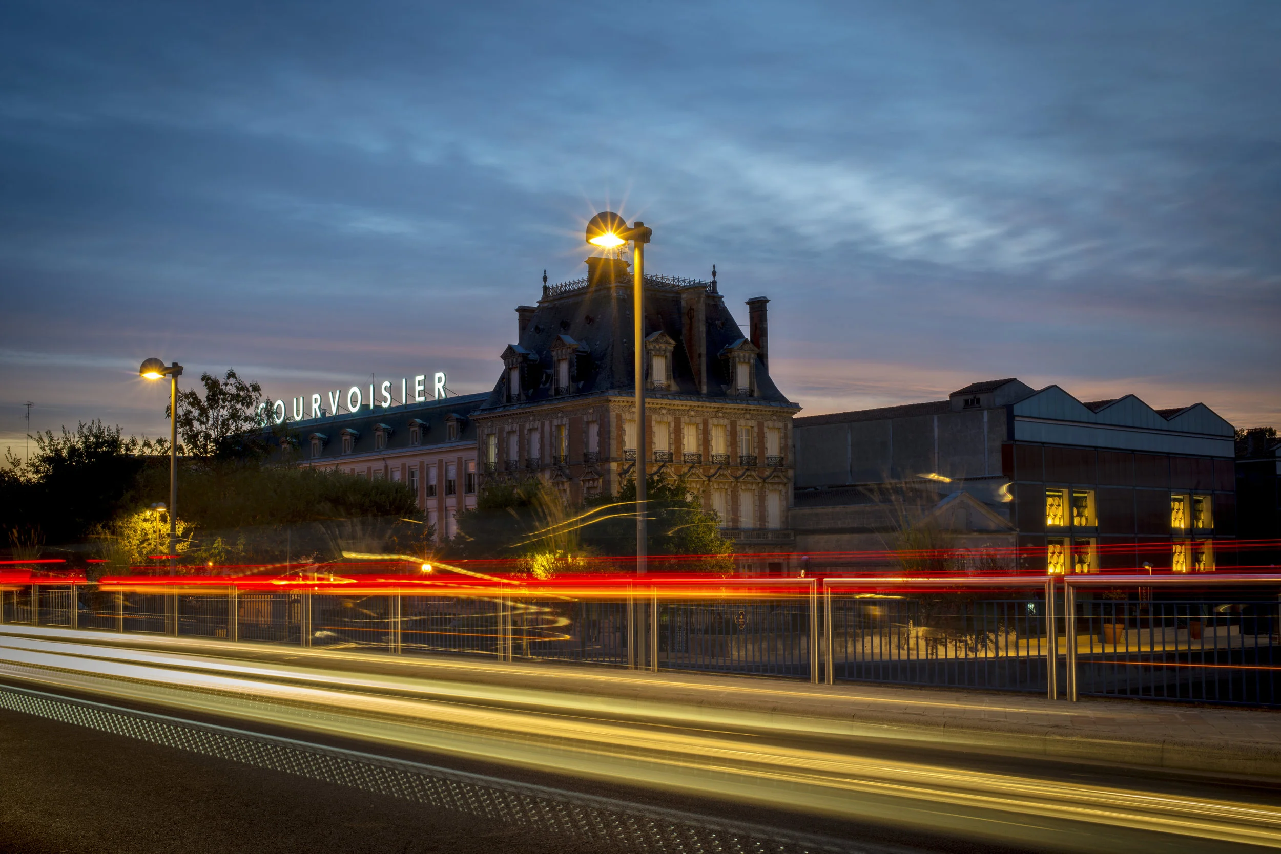
Courvoisier Harvest Campaign
Client: Courvoisier
Role: Creative Direction, Photography
THE STORY
By 2017, Courvoisier’s international imagery across social media, ecommerce, and branded content had grown stagnant. The monotone visual system the brand had invested heavily in years prior was beginning to feel repetitive and dated. For a house rooted in heritage and craftsmanship, the imagery no longer reflected the depth, elegance, or vitality of the brand.
THE OBJECTIVE
Capture a new global image library during the 2016 grape harvest in Jarnac, France that authentically expressed the craftsmanship and provenance behind Courvoisier. The work needed to feel timeless, elevated, and versatile enough to live across international channels for years to come. It also needed to be executed efficiently, delivering premium results at a fraction of traditional large-scale production costs.
THE MOVE
With a lean crew consisting of myself as photographer and creative lead alongside one stylist, we traveled to Jarnac and Paris equipped with three cameras and a drone. Over five days of intensive shooting from dusk until dawn, we documented every layer of the brand’s story. We captured three vineyards during harvest, the distillery, the cooperage, the château grounds, the bottling plant, and atmospheric Parisian vignettes that contextualized the spirit within its cultural home.
The approach balanced documentary authenticity with refined composition, ensuring the imagery felt cinematic yet honest. By remaining agile and immersed in the environment, we were able to capture over 2,000 images across multiple lighting conditions and brand moments, creating a comprehensive visual library rather than a single campaign shoot.
THE RESULT
The refreshed imagery reinvigorated Courvoisier’s global digital presence and provided the brand with a versatile, long-term asset library. The client response was overwhelmingly positive, and the content rolled out across UK channels before expanding into U.S. media placements.
What began as a cost-conscious harvest shoot became a foundational visual reset for the brand — elevating perception while maximizing efficiency.
Larceny Bourbon
Client: Heaven Hill Distillery
Role: Creative Direction, Naming, Story, Packaging
THE STORY
In 2012, Heaven Hill Distillery set out to revive a historic wheated bourbon once known as Old Fitzgerald. The distilling method would honor tradition. The taste profile would be modernized. What didn’t exist yet was a name, a story, or a visual identity strong enough to compete in a category dominated by heritage giants.
THE OBJECTIVE
Create a brand from the ground up — name, narrative, and packaging — that could stand confidently alongside Buffalo Trace, Maker’s Mark, and Jim Beam. It needed to feel authentic to bourbon history while carving out a distinct, memorable position on shelf.
THE MOVE
The breakthrough came from history itself. In researching Old Fitzgerald, we uncovered a lesser-known truth about John E. Fitzgerald. Contrary to legend, he was not simply a bourbon aficionado — he was a bonded treasury agent. At the time, treasury agents were the only individuals legally permitted to carry keys to barrel warehouses.
According to distillery lore, Fitzgerald used those keys to access — and quietly siphon — the finest barrels for himself. Those barrels became known internally as “Fitzgerald barrels.”
From that act of refined theft, a new name was born: Larceny.
The packaging became the storyteller. A die-cut keyhole pierces the label, revealing a golden key inset behind it — an immediate visual metaphor tied directly to the legend. The bottle doesn’t just sit on shelf. It invites discovery. The campaign and brand narrative flowed directly from the design system, reinforcing the myth at every touchpoint.
THE RESULT
Larceny launched as a distinctive, story-driven entrant in the premium wheated bourbon category. The design and positioning helped establish the brand as a credible competitor in a crowded heritage space, earning industry recognition and awards for both packaging and advertising.
Larceny didn’t just revive history. It reframed it.
AWARDS
Winner — Packaging — American Graphic Design Awards — 2015 1st Place — New Product Packaging — Beverage Dynamics — 2013 1st Place — New Product Advertising — Beverage Dynamics — 2013 Merit Award — New Product Packaging — Milwaukee99 Awards — 2013
impact Brand Refresh
ROLE:
Executive Creative Director
Timeline: 6 Months
Context: 24% Year-over-Year Growth for Three Consecutive Years
THE PROBLEM
By 2021, Impact Networking was growing at an average of 24 percent year over year. The business was accelerating, but the brand was not. Visual systems were inconsistent, sales materials lacked cohesion, and the company was operating from a two-page guideline that included little more than a logo, two fonts, and a tagline.
The organization was scaling like a modern company. The brand still felt corporate and dated.
THE MOVE
I was brought in to evolve the brand without erasing its equity. Rather than replacing the logo, we reworked the system around it, liberating the icon from the wordmark and creating more flexible applications across a refined palette.
We simplified typography and layout structures to create clarity and restraint in a visually saturated world. At the same time, we shifted the voice from rigid and corporate to confident, human, and approachable.
Beyond the visual identity, I directed the strategy and creative execution of a new website built around the refreshed brand. The goal was alignment — ensuring that sales, marketing, and digital touchpoints told the same story with the same level of polish.
THE RESULT
Within six months, we launched a comprehensive brand system designed for scale. The refreshed website drove measurable pipeline impact, including a 79% increase in MQLs, a 31% increase in SALs, and a 19% increase in Opportunities.
We continued building on that momentum through 2024 to 2025, increasing managed services leads with a 5% lift in MQLs, 34% growth in SALs, 9% growth in SQLs, and a 5% increase in Opportunities.
Most importantly, revenue tied to marketing-led efforts surged year over year, including a 719% increase in net new revenue, a 922% increase in cross sell revenue, and 101% YoY revenue growth.
More importantly, the brand finally matched the ambition of the organization. It felt modern. Cohesive. Expressive. Recognizably Impact, but elevated.
The business was growing like a premium partner. The brand now performs like one.
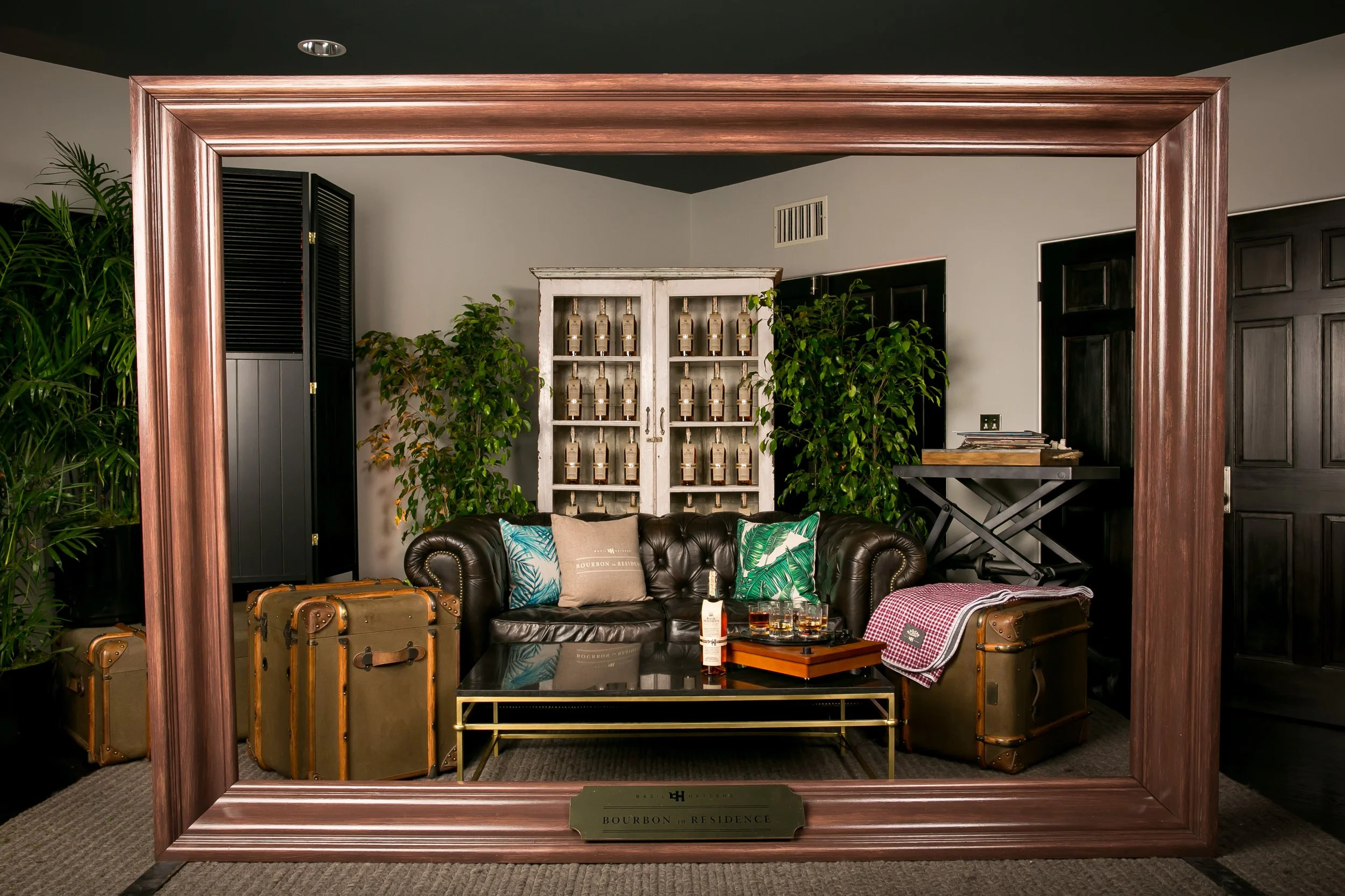
Basil Hayden’s Bourbon in Residence
Client: Basil Hayden’s
Agency: Beam Suntory
Role: Creative Direction, Experiential Design
THE STORY
What began as a single Mother’s Day bourbon brunch in Kentucky evolved into a scalable national experiential platform.
The original activation — inviting bartenders and their mothers into a refined, emotionally resonant Basil Hayden’s experience — generated overwhelming positive feedback and meaningful trade engagement. It became clear this was more than an event. It was a relationship strategy.
From that success, Basil Hayden’s Bourbon in Residence was born.
THE OBJECTIVE
Deepen brand affinity among influential bartenders in key cultural markets and drive recommendation at the point of sale. Rather than relying on traditional trade programming, we built an experience-led platform designed to create emotional memory and long-term brand advocacy.
THE MOVE
In markets including Los Angeles, Denver, Miami & DC, we transformed architecturally distinctive residences into immersive Basil Hayden’s environments. Notable bartenders from respected establishments were invited to bring friends and family into elevated, design-forward spaces where the brand was lived rather than promoted. Guided tastings, craft-forward cocktail experiences, curated hospitality, and personalized activations reinforced Basil Hayden’s refined yet approachable positioning. Each city followed the same strategic blueprint while adapting to local culture and aesthetic nuance.
THE RESULT
Bourbon in Residence expanded into multiple key markets and engaged hundreds of high-value trade influencers across cities.
• 90%+ positive post-event sentiment among attendees
• Significant increase in bartender recommendation intent following participation
• Measurable lift in on-premise placements within participating accounts
• Social amplification across key markets with strong organic engagement
Most importantly, the platform created durable brand memory among the very people who influence consumer choice at the bar.
Instead of asking for loyalty, Basil Hayden’s earned it —
one residence at a time.
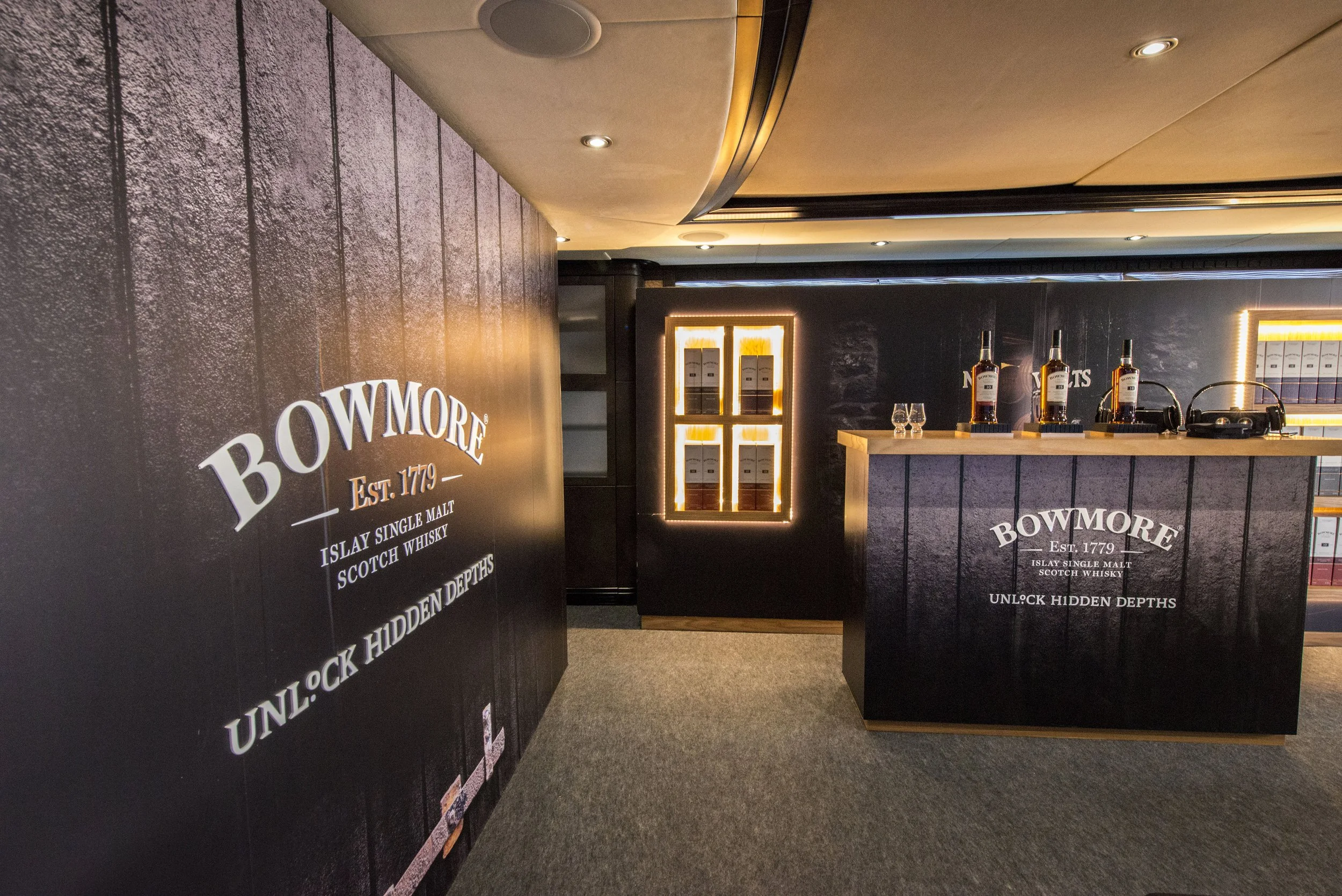
House of Suntory Harrods, London U.K.
Client: Suntory Whisky
Retail Partner: Harrods
Role: Creative Direction, Environmental & Digital Design
THE STORY
In 2017, Harrods of London partnered with Suntory Whisky to create a permanent branded presence within the luxury spirits room. After negotiation, the opportunity evolved into something more ambitious than a display fixture — a fully designed walk-in vault dedicated to Suntory’s flagship portfolio.
The space would need to honor both brands: the quiet precision of Japanese craftsmanship and the uncompromising luxury standards of Harrods.
THE OBJECTIVE
Design a premium experiential environment called “House of Suntory” where consumers could immerse themselves in the harmony of Japanese nature and whisky-making tradition. The space needed to educate visitors on the portfolio in an engaging and interactive way, while blending seamlessly into one of the world’s most iconic luxury retail environments.
It was not simply about visibility. It was about reverence.
THE MOVE
Completed in early 2018, the House of Suntory was conceived as a modern vault built from floating oak panels, acrylic glass, and restrained digital integration. The material palette reflected Japanese minimalism — warm wood, precise geometry, negative space.
Limited-edition bottles appear to hover on nearly invisible shelving, accentuated by dramatic under-lighting that elevates the craftsmanship of each expression. At the heart of the installation, five flagship variants sit beneath a 70-inch 4K monitor powered by Perch interactive technology. Visitors are invited to lift a bottle from its plinth, triggering variant-specific storytelling through motion-sensing technology.
When not activated, the screen displays serene seasonal imagery from the distillery grounds, creating a calm, almost meditative retail environment that contrasts beautifully with the bustle of the store floor.
THE RESULT
The House of Suntory launched in early 2018 and immediately strengthened premium portfolio performance. Combined premium brand sales increased 12.8 percent following installation, validating both the experiential strategy and retail integration. Originally planned as a temporary installation, Harrods extended the presence through 2019 due to strong commercial performance and positive consumer response.
The project transformed shelf space into sanctuary — elevating both brand perception and retail impact within one of the world’s most prestigious luxury destinations.
Belden Barns
Client: Belden Barns Vineyards
Role: Brand Identity, Packaging Design
THE STORY
Belden Barns began as a dream — Nate and Lauren Belden’s vision to cultivate exceptional wines in Sonoma County.
When the land was secured and the vineyard established, the next step was defining a brand identity that could reflect both the craft of the wine and the personal story behind it.
The portfolio would include Pinot Noir, Syrah, Grenache, Grüner Veltliner, Chardonnay, Sauvignon Blanc, and Viognier — each requiring a cohesive yet distinctive presence on shelf.
THE OBJECTIVE
Create an identity and label system that felt authentic to the founders’ story while standing confidently within the refined landscape of Sonoma wines.
The brand needed to feel personal without becoming sentimental. Rustic, but elevated. Memorable at shelf without competing through noise.
THE MOVE
The breakthrough came from a defining moment in the founders’ history — their wedding reception.
At the celebration, guests were invited to tie handwritten wishes onto a “Tree of Wishes” using string and small red tags. The gesture symbolized hope, commitment, and shared belief in the couple’s future.
Those red tags became the foundation of the identity.
Each label features a symbolic tag — a visual nod to the founders’ wish realized through the vineyard itself. The system was printed on recyclable kraft paper, reinforcing the vineyard’s rustic elegance and commitment to authenticity.
The result was a tactile, story-driven packaging system rooted in meaning rather than decoration.
THE RESULT
Belden Barns launched with a distinctive, cohesive identity that set it apart within Sonoma’s competitive boutique wine landscape.
The brand’s packaging became an extension of its origin story — understated, personal, and unmistakably authentic.
A vineyard born from a wish.
A label built to tell it.
BSI Global Travel retail Summit, Cannes France
Client: Beam Suntory
Role: Creative Direction, Experiential Strategy, Environmental Design
THE STORY
Each year, Beam Suntory attends the Global Travel Retail Summit in Cannes as the world’s third largest spirits company. In an environment where every major brand competes aggressively for attention, differentiation is essential. Securing placement in the global duty free arena requires more than product display — it demands memorability. The opportunity was to rethink what presence at GTR could mean.
THE OBJECTIVE
Design a premium, comfortable headquarters space where Beam Suntory could showcase its global portfolio, host key stakeholder meetings, and hold flagship brand events throughout the week.
Additionally, for one pivotal evening, the space would transform into the Bowmore Vault — an immersive environment inspired by the legendary No. 1 Vaults, the world’s oldest Scotch maturation warehouse — to launch a new travel-retail-exclusive range to 75 VIP guests.
The challenge was to create something that could operate as both corporate hub and theatrical brand experience.
THE MOVE
Cannes is synonymous with wealth, luxury hotels, and superyachts. With the summit taking place directly on the French Riviera, the solution was clear: move the experience to the water. We chartered the 121-foot luxury yacht Grenadines III and transformed it into Beam Suntory’s floating headquarters for the week-long conference. The on-water setting immediately differentiated the brand from traditional exhibition halls and provided an elevated escape for partners and stakeholders.
A custom-built jetty reception tent welcomed guests with signature cocktails and branded touchpoints before boarding. A 30-foot glass display featuring the full Beam Suntory portfolio anchored the quay, while digital screens reinforced brand storytelling. Onboard, two levels of bars, lounges, and private meeting rooms were seamlessly integrated with curated bottle displays that complemented the yacht’s architecture.
For one night only, the vessel was completely reimagined as the Bowmore No. 1 Vault. Custom vault doors were installed at the stern for a dramatic arrival. The environment shifted from Riviera luxury to Islay heritage, immersing guests in elevated tastings, oyster luges, live bagpipes, and a virtual reality experience transporting them directly to the distillery itself.
THE RESULT
The yacht concept became one of the most talked-about activations of the summit, driving a record number of visits throughout the week. The Bowmore Vault event generated significant pre-orders for the new travel retail range across international duty free markets, validating both the experiential strategy and commercial impact.
The waterfront presence proved so successful that other global spirits brands began adopting similar yacht-based activations in subsequent years. What began as a bold differentiation strategy became a new standard within the conference landscape.
Beam Suntory did not simply attend GTRS, It redefined how a global spirits company could show up.
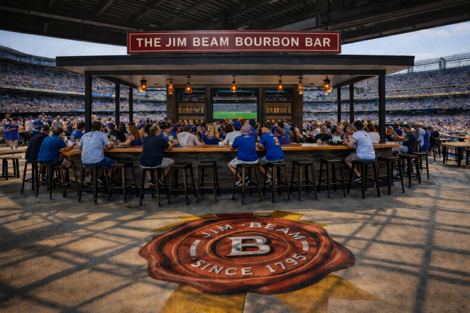
Stadium & Venue Brand Environment Design
Client: Beam Suntory
Role: Creative Direction, Experiential Design, Spatial Strategy
THE STORY
Beam Suntory’s regional field teams frequently secure strategic partnerships with professional sports franchises across the NBA, NFL, and MLB. These partnerships extend beyond sponsorship visibility, often creating opportunities to establish permanent branded footprints inside stadium concourses, suites, outfield zones, and even airport terminals.
The opportunity was not simply to place logos inside venues, but to design physical environments that translate brand personality into built experience — spaces where fans gather, connect, and consume.
THE OBJECTIVE
Design and build immersive brand destinations that function as both high-performing concession environments and memorable experiential touchpoints.
Each space needed to deliver quality cocktails, operational efficiency, and strong visual storytelling while responding to the realities of a stadium setting: high volume, speed of service, durable materials, and intuitive traffic flow.
Beyond utility, the goal was to create “stadium destinations” — environments fans would intentionally seek out before, during, and after games. The spaces needed to feel premium without slowing service, immersive without compromising throughput, and distinct while aligning with the architectural language of each venue.
THE MOVE
Between 2015 and 2018, I led the design and development of more than ten branded stadium environments across multiple Beam Suntory portfolios. Many projects began with a blank canvas inside raw concourse or suite spaces.
Each activation translated brand identity into architectural form through material selection, lighting, custom displays, and integrated seating concepts. Cocktail programming was thoughtfully adapted for sporting environments, balancing elevated serves with speed and practicality.
From bourbon-forward lounges to vibrant tequila haciendas, the environments were designed as experiential anchors within the larger venue ecosystem — premium spirits destinations that elevated the stadium’s hospitality offering while driving brand connection at scale.
THE RESULT
More than ten in-stadium and venue-based environments were successfully launched across major U.S. markets, several of which remain under continuous contract today. These spaces have become popular fan destinations and celebrated additions to their respective stadium amenities.
By blending operational strategy with experiential design, the work transformed sponsorship assets into permanent, revenue-driving brand environments — reinforcing brand presence while enhancing the overall fan experience.
SELECTED PROJECTS
The Jim Beam Black Club — PPG Paints Arena
The Jim Beam Bourbon Bar — New Era Field
Effen Vodka Bar — SunTrust Park
The Jim Beam Highball Bar — Citi Field
The Stillhouse South — BMO Harris Bradley Center
Hornitos Hacienda — Citi Field
The Jim Beam Bourbon Bar — Citi Field
Jim Beam Apple Bar Concept — Citi Field
RumTiki Concept — LAX Airport
Jim Beam Pop-Up Experience — Brooklyn Boardwalk
More Fun With Every Flavor
Client: Heaven Hill Distillery
Brand: Burnett’s Vodka
Role: Creative Direction, Campaign Development, Integrated Execution
THE STORY
In the hyper-competitive vodka category, innovation isn’t optional — it’s survival. Shelf space is earned through constant newness, especially in flavored vodka where consumer attention shifts quickly.
Burnett’s had quietly built one of the most expansive flavor portfolios in the category: 27 distinct offerings. The product innovation was there. What it lacked was a unifying idea bold enough to own that scale — and energize a younger, occasion-driven audience.
THE OBJECTIVE
Transform variety into leadership.
Position Burnett’s as the vodka with more personality, more energy, and more fun than anyone else on shelf. The strategy needed to resonate with 21–29 year-old consumers in key growth markets while elevating the brand’s presence across retail, digital, and on-premise environments.
This wasn’t about adding another flavor.
It was about owning flavor.
THE MOVE
The breakthrough was simple and direct:
More Fun With Every Flavor.
Instead of treating the 27 flavors as a product list, we turned them into a brand asset — a visual and cultural advantage. Arresting graphics, vibrant color systems, and party-forward storytelling created a unified campaign language that celebrated variety rather than fragmenting it.
The campaign rolled out as a fully integrated, multi-platform initiative including:
National print and digital advertising
On- and off-premise programming
Retail activation
Digital marketing and social media
Every touchpoint reinforced the same core message: Burnett’s delivers more fun, because Burnett’s delivers more flavor.
THE RESULT
Between 2013 and 2015:
Burnett’s achieved +19% national growth in flavored vodka.
The brand climbed from #18 to #10 in total U.S. spirits.
Sales surpassed 1.5 million cases annually.
Burnett’s maintained its position as the 7th best-selling vodka in the U.S.
What began as product breadth became brand momentum.
Burnett’s didn’t just compete in flavored vodka.
It owned the conversation.
AWARDS
3rd Place — Full Page Print Ad — Beverage Dynamics Awards — 2013
Seriously Good Bourbon
Client: Heaven Hill Distillery
Brand: Evan Williams Bourbon
Role: Creative Direction, Campaign Development, Broadcast, Packaging Refresh
THE STORY
Evan Williams was ready for reinvention and a campaign refresh.
As America’s #3 best-selling straight bourbon, the brand had scale — but needed a refreshed voice. The bourbon category was becoming increasingly crowded and premium-driven, while category growth was flattening.
Evan Williams needed a campaign that felt confident, modern, and unmistakably bourbon — without abandoning its mass-market strength.
THE OBJECTIVE
Develop a fully integrated campaign spanning outdoor, print, and broadcast — anchored by a 30-second television spot born directly from the visual language of the print work.
The idea needed to feel bold yet straightforward.
Premium, but not precious.
Authentic without chasing heritage clichés.
THE MOVE
The breakthrough was clarity. Seriously Good Bourbon. Two words. No fluff. No over-romanticizing.
Visually, the campaign embraced bold orange bourbon tones and rich textures paired with clean, confident typography and straightforward photography. The layouts were intentionally minimal — allowing the product and message to carry authority.
The broadcast execution extended the print system directly into motion. The 30-second spot was written and developed to bring the simplicity and confidence of the campaign into a cinematic format without losing its graphic backbone.
Simultaneously, a packaging refresh introduced refined glass-blown signature details, reinforcing quality at shelf and aligning the physical product with the elevated campaign voice.
THE RESULT
From 2013–2014, Evan Williams achieved double-digit growth while the bourbon category remained flat. The brand continued to outperform category growth following launch.
New campaign concepts tested with a dramatic 54% purchase intent — validating both creative direction and strategic positioning.
Evan Williams didn’t chase bourbon mythology.
It owned its confidence.
Spirits Packaging
PACKAGING
Spirits packaging is where strategy, story, and craft intersect. The following work reflects brands I’ve designed and directed across the category.
Photography
Photography is a core part of my creative practice.
What began as curiosity evolved into a disciplined pursuit of light, composition, and atmosphere. It continues to inform how I think about brand, storytelling, and physical space. Whether shooting interiors, food and beverage, events, or portraiture, the goal is always the same — clarity, mood, and authenticity.
My work has been featured in publications including Chicago Reader, New City, DiningOut, and ChicagoScene. I also serve as an elite field photographer for the Chicago real estate community, capturing high-end properties throughout Chicagoland.
Over time, I’ve partnered with notable restaurateurs, hospitality groups, and real estate leaders. Select clients include Morimoto, Trump Hotel, Yellow Tail, Perillo BMW, Baird & Warner, @properties, DiningOut, and Jam Productions.
Photography isn’t separate from my creative direction.
It sharpens it.
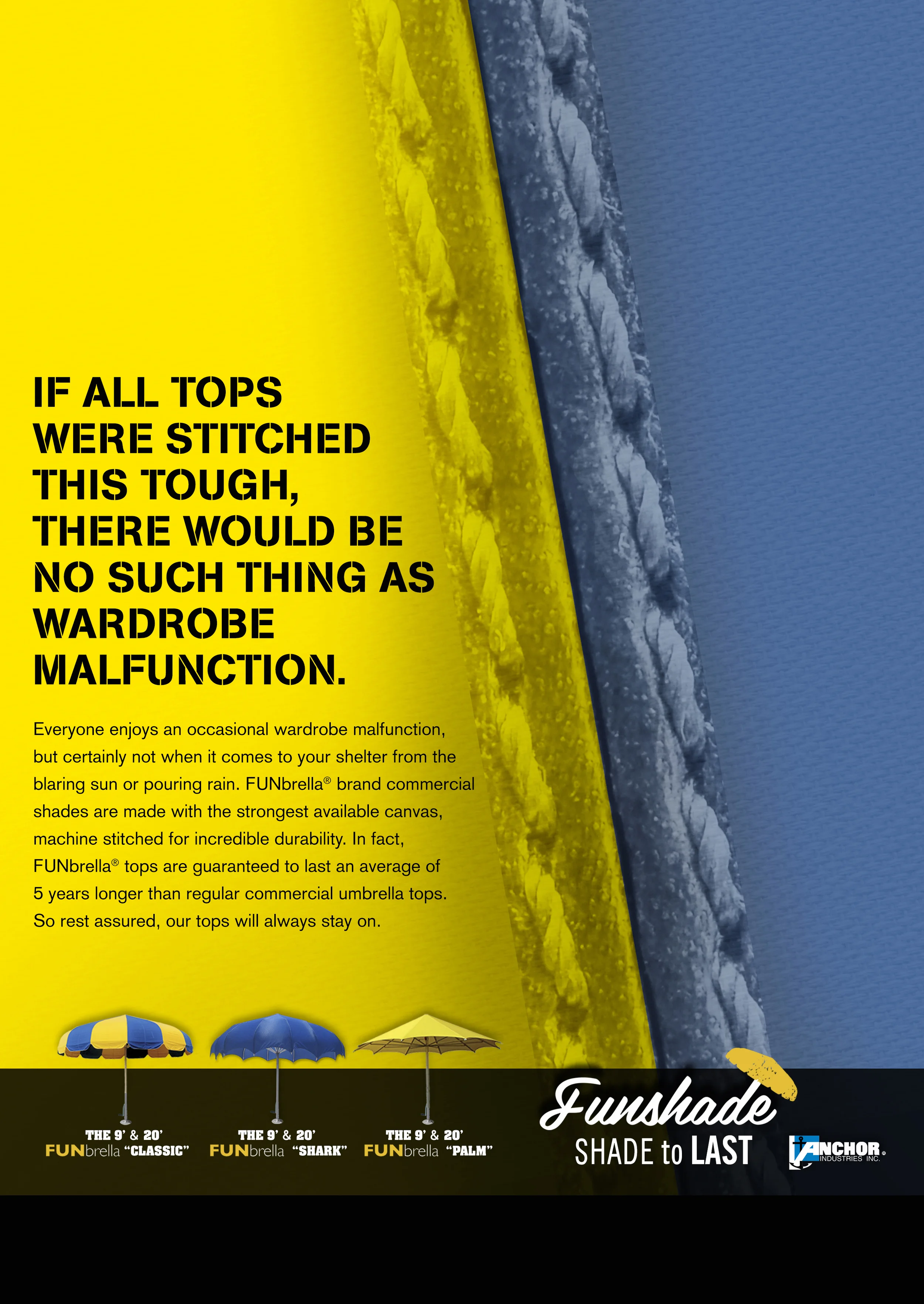
Funshade
Client: Funshade
Role: Creative Direction, Campaign Development
THE STORY
Funshade manufactures large-scale, commercial-grade umbrellas built for demanding environments. These aren’t backyard accessories — they’re industrial structures designed to withstand wind, sun, water, and heavy public use.
Installed at pools, theme parks, water parks, and recreational destinations, the product lives at the intersection of durability and leisure.
The challenge was balancing both.
THE OBJECTIVE
Position Funshade as the last outdoor umbrella you will ever need to buy — while celebrating the environments where the product thrives.
The brand needed to communicate two distinct but complementary truths:
Engineered toughness.
Built for fun.
Rather than dilute the message, we built two campaign tracks — one grounded in performance, the other in experience.
THE MOVE
The first campaign focused on structural integrity and engineering strength. Visuals highlighted industrial components, reinforced materials, and real-world durability under extreme conditions. The tone was confident, direct, and built around permanence.
The second campaign shifted perspective — showcasing the product in its natural habitat. Pools. Water parks. Recreational spaces filled with movement and color. The umbrella became less an object and more a facilitator of memorable moments.
Together, the campaigns reframed Funshade from a commodity supplier to a long-term investment in both infrastructure and experience.
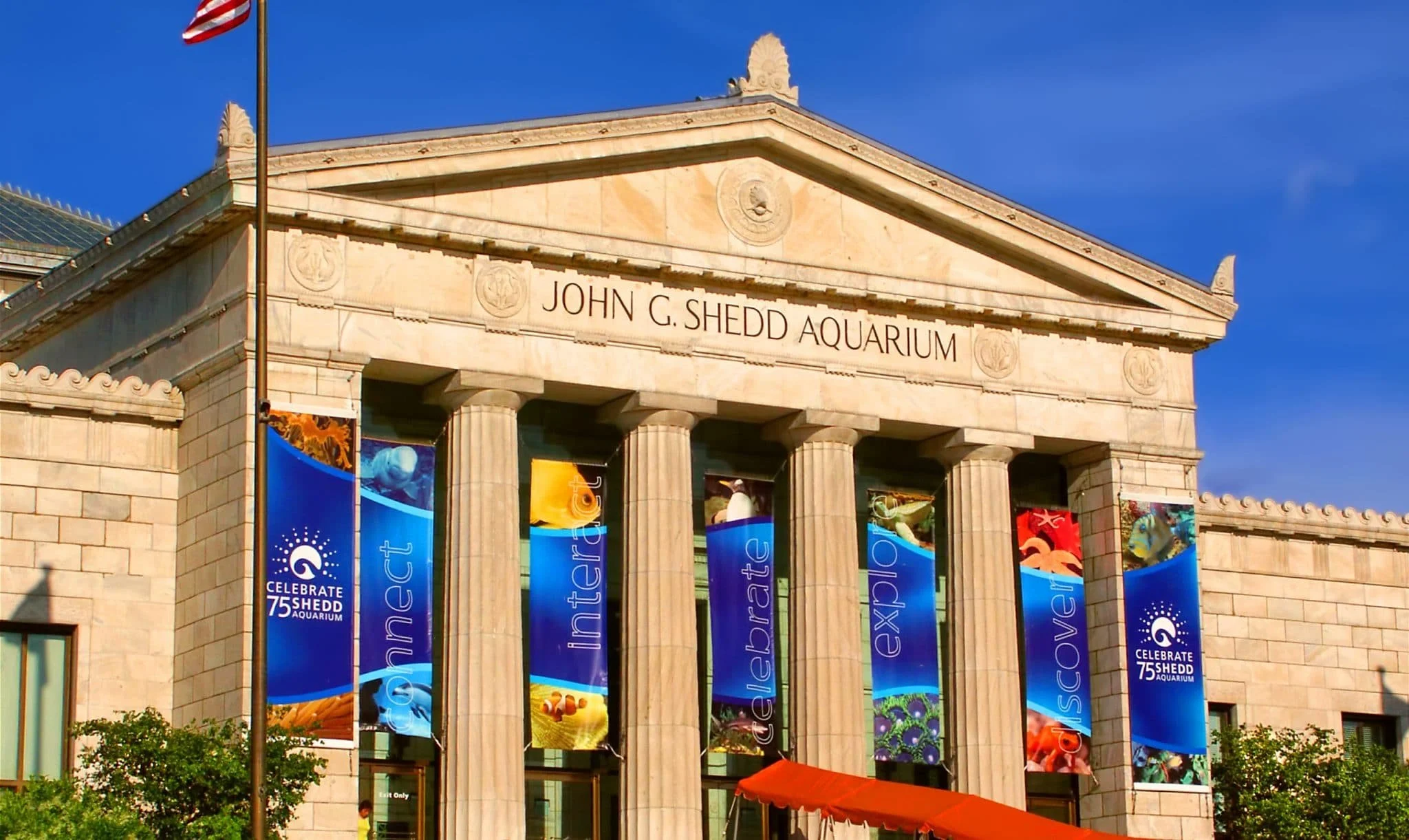
John G. Shedd Aquarium
Client: Shedd Aquarium
Role: Brand Identity, Environmental Design
THE STORY
As Shedd Aquarium approached its 75th anniversary, the institution sought a commemorative identity worthy of one of Chicago’s most iconic cultural landmarks.
The celebration required more than a logo. It needed a visual system that could live across architecture, interiors, and the city itself — honoring heritage while signaling continued relevance.
THE OBJECTIVE
Develop a distinctive anniversary mark and large-scale environmental graphics that could integrate seamlessly with the museum’s historic presence.
The identity needed to feel celebratory but not ornamental. Historic but not nostalgic. Strong enough to scale across exterior banners, interior installations, and citywide placements.
THE MOVE
The solution centered on a commemorative mark that balanced institutional gravitas with modern clarity. The anniversary identity was designed to integrate effortlessly into large-format applications — ensuring legibility, impact, and cohesion across diverse environments.
The system extended across exterior banners, interior signage, and city placements — creating a unified visual presence throughout the duration of the celebration.
THE RESULT
The design was selected to represent Shedd Aquarium’s 75th anniversary and remained in market for a full year.
Banners and environmental graphics were prominently displayed on the museum façade, throughout interior spaces, and across Chicago — reinforcing the milestone at both civic and institutional scale.
A temporary campaign that became part of the city’s visual landscape.
SCROLL DOWN ↓
Carquest
Client: Carquest
Role: Creative Direction, Campaign Development
THE STORY
Carquest was seeking a new agency partner and a refreshed creative platform to modernize its brand presence.
The category was crowded with technical language, aggressive promotions, and insider tone. For many consumers, buying auto parts felt intimidating — even transactional.
There was an opportunity to humanize the experience.
THE CHALLENGE
Reframe the act of buying car parts from daunting to approachable.
Develop a creative strategy that made Carquest feel welcoming, knowledgeable, and unexpectedly easy — while signaling a visual and tonal departure from the brand’s dated creative.
The work needed to impress at pitch level and demonstrate a scalable campaign platform across print, transit, outdoor, and broadcast.
THE MOVE
The insight centered on accessibility.
Carquest isn’t just for mechanics — it’s for everyday people. People you wouldn’t expect. Parents. Students. First-time DIYers.
The campaign spotlighted relatable individuals navigating car maintenance with confidence — supported by Carquest’s knowledgeable service, wide selection, and value-driven pricing.
The tone was human, optimistic, and clear.
The design system modernized the brand without alienating its core audience.
A fully integrated campaign platform was developed across print, transit, outdoor, and television — designed to scale nationally.
THE RESULT
While the agency did not secure the full account, the strength of the creative platform led to new business wins in point-of-sale and print programs.
The pitch demonstrated a viable path forward for the brand — one rooted in accessibility, clarity, and everyday confidence.
SCROLL DOWN ↓
Logo / Typography
SCROLL DOWN ⬇︎
Copywriting
Client: Heaven Hill Distillery
Brand: Evan Williams Bourbon
Role: Creative Direction, Concept Development, Copywriting
THE STORY
In preparation for a major brand presentation, I developed two additional campaign platforms to expand the creative range beyond the primary direction being presented.
The goal wasn’t redundancy — it was optionality.
Provide the client with distinct strategic territories, each fully formed and defensible.
Both platforms were written and art directed from the ground up — headlines, taglines, visual systems, and positioning frameworks.
THE MOVE
Each campaign explored a different expression of bourbon confidence.
One leaned into bold, declarative simplicity.
The other elevated craftsmanship and character through sharper narrative tone.
Both were designed as scalable systems across print, outdoor, and broadcast — not speculative concepts, but ready-to-launch platforms.
This project also marked a shift in my own creative evolution. I authored every headline and tagline, formally expanding my role from designer to writer and establishing a more integrated creative voice.
THE RESULT
In focus groups and online testing, both campaigns scored exceptionally well.
One platform outperformed the direction that ultimately launched as “Seriously Good Bourbon.”
Though neither campaign moved forward, the work demonstrated measurable strategic strength and broadened the client’s understanding of the brand’s tonal possibilities.
Sometimes the ideas that don’t launch still prove the range.
SCROLL DOWN ↓